In this series of tutorials we are using SwiftUI to build a login page for a chat application. See our earlier blog which covered some of the basic first stages of creating a user interface with buttons and text fields. The following tutorial will focus on validating data entered by users and building a more advanced user interface.
QuickBlox SwiftUI tutorial Series:
Let’s Get Started !
You can download the finished project from this Github repository.
Validating data entered by the user
For login validation, the following conditions are given:
“Use your email or alphanumeric characters in a range from 3 to 50. First character must be a letter.” Let’s use the regular expressions “^[a-zA-Z][a-zA-Z0-9]{2,49}$” and “^[A-Z0-9a-z\\._%+-]+@( [A-Za-z0-9-]+\\.)+[A-Za-z]{2.49}$”.
For password validation, the following conditions must be met:
“Use alphanumeric characters in a range from 8 to 12. First character must be a letter.” And Therefore, we use the regular expression “^[a-zA-Z][a-zA-Z0-9]{7,11}$”
Create an enum Regex and add it to your file above the struct LoginScreen:
enum Regex: String {
    case login = "^[a-zA-Z][a-zA-Z0-9]{2,49}$"
    case email = "^[A-Z0-9a-z\\._%+-]+@([A-Za-z0-9-]+\\.)+[A-Za-z]{2,49}$"
    case password = "^[a-zA-Z][a-zA-Z0-9]{7,11}$"
}
Next, create an extension for String, in which you can check if the entered string is valid. To do this, create a new String+Extension.swift file:
import Foundation

extension String {
    func isValid(regexes: [String]) -> Bool {
        for regex in regexes {
            let predicate = NSPredicate(format: "SELF MATCHES %@", regex)
            if predicate.evaluate(with: self) == true {
                return true
            }
        }
        return false
    }
}
The function func isValid(regexes: [String]) -> Bool can take multiple regular expressions and check the string against the conditions set by the regular expressions.
Let the “Login” button become active when the entered login and password are correct.
You can introduce new pain variables isValidLogin and isValidPassword and track their states:
@State private var isValidLogin: Bool = false
@State private var isValidPassword: Bool = false
Now you can enable or disable the “Login” button depending on the change in the value of these variables.
Add the modifier .disabled((isValidLogin && isValidPassword) == false) to the “Login” button.
Move the button code to a new file.
Create a new SwiftUI View file called “LoginButton” and transfer the button code to it.
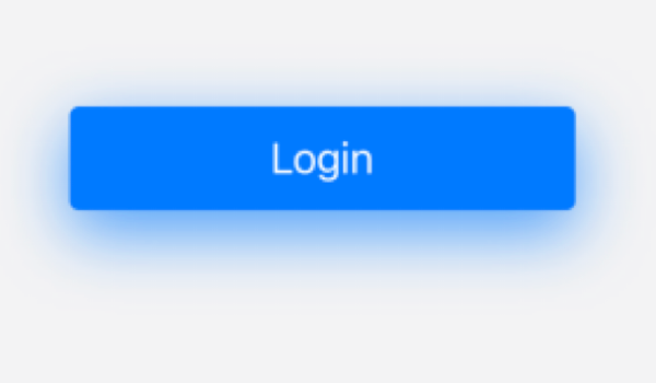
Also, according to the condition of the task, when the login and password become valid, the button should change color and it should have a shadow.
Add the appropriate modifiers:
import SwiftUI

struct LoginButton : View {

    @Binding var isValidLogin: Bool
    @Binding var isValidPassword: Bool

    var body: some View {
        return Button {
            debugPrint("Login Button Tapped!")
        } label: {
            Text("Login")
                .foregroundColor(.white)
                .font(.system(size: 18))
                .frame(width: 215, height: 44, alignment: .center)
        }
        .disabled((isValidLogin && isValidPassword) == false)
        .background(isValidLogin && isValidPassword ? .blue : .secondary)
        .cornerRadius(4)
        .shadow(color: isValidLogin && isValidPassword ? .blue.opacity(0.7) : .clear,
                radius: 14, x: 0, y: 9)
        .padding(.top, 36)
    }
}
When the login and password meet the conditions, your button will become active and take the following form:
Username and Password Fields
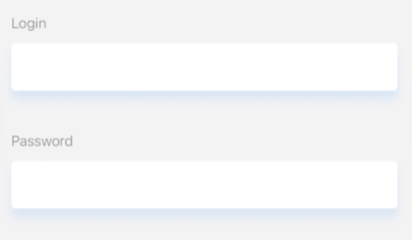
Now let’s take a look at the username and password fields.
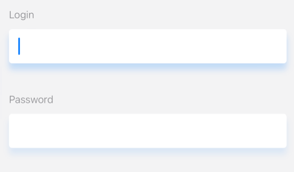
According to the specs and design, these text fields have shadows that become darker when the field is active.
Also, when entering characters into the text field, a hint should appear for the user if the entered string is not valid and disappear if the string becomes valid.
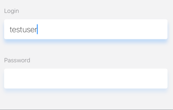
This behavior is shown in the screenshots below.
1. Start
2. User clicked on LoginTextField
3. User entered invalid data
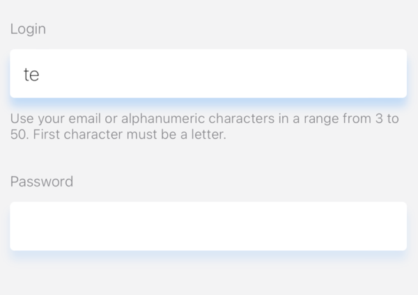
4. User entered valid data
You need to describe the text for the hints.
To do this, add enum Hint: String with hints for login and password:
enum Hint: String {
    case login = "Use your email or alphanumeric characters in a range from 3 to 50. First character must be a letter."
    case password = "Use alphanumeric characters in a range from 8 to 12. First character must be a letter."
}
To begin with, make a new file “LoginTextField” and transfer the code of the text field for entering the login there.
You need to create a new “TextFieldHint” file to display the hint:
import SwiftUI

struct TextFieldHint: View {
    let hint: String
    var body: some View {
        return Text(hint)
            .font(.system(size: 12, weight: .light))
            .foregroundColor(.secondary)
            .frame(height: hint.isEmpty ? 0 : 29)
            .frame(maxWidth: .infinity, alignment: .leading)
    }
}
Now the LoginTextField code looks like this:
import SwiftUI

struct LoginTextField : View {

    @State private var login: String = "" {
        didSet {
            isValidLogin = login.isValid(regexes: [Regex.login, Regex.email].compactMap { "\($0.rawValue)" })
            loginHint = isValidLogin ? "" : Hint.login.rawValue
        }
    }
    @State private var loginHint: String = ""
    @Binding var isValidLogin: Bool
    @Binding var isFocused: Bool?

    var body: some View {
        return VStack(alignment: .leading, spacing: 11) {
            TextFieldName(name: "Login")

            TextField("", text: $login, onEditingChanged: {isEdit in
                isFocused = isEdit
            })
            .accentColor(.blue)
            .onChange(of: login, perform: { newValue in
                self.login = newValue
            })
            .font(.system(size: 17, weight: .thin))
            .foregroundColor(.primary)
            .disableAutocorrection(true)
            .autocapitalization(.none)
            .frame(height: 44)
            .padding(.horizontal, 12)
            .background(Color.white)
            .cornerRadius(4.0)
            .shadow(color: isFocused == true ? .blue.opacity(0.2) : .blue.opacity(0.1),
                    radius: 4, x: 0, y: 8)

            TextFieldHint(hint: loginHint)
        }
    }
}
Let’s analyze the changes in more detail.
@State private var login: String = "" {
    didSet {
        isValidLogin = login.isValid(regexes: [Regex.login, Regex.email].compactMap { "\($0.rawValue)" })
        loginHint = isValidLogin ? "" : Hint.login.rawValue
    }
}
The login: String variable is declared here, and the validity of the entered login is checked in the didSet block:
isValidLogin = login.isValid(regexes: [Regex.login, Regex.email].compactMap { "\($0.rawValue)" })
And further:
loginHint = isValidLogin ? "" : Hint.login.rawValue
// set login hint text to this variable
@State private var loginHint: String = ""

@Binding var isValidLogin: Bool // this is the binding to
@State private var isValidLogin: Bool = false // on the LoginScreen we added earlier.
// Thanks to this, we will be able to monitor the change in the validity of the login in real time.

@Binding var isFocused: Bool? // this is it binding to
@State private var isFocused: Bool? // on the LoginScreen which it's time to add.
//Thanks to this, we will be able to keep track of which text field currently has focus in real time.
//We need this for the correct display of shadows for LoginTextField and PasswordTextField.

TextField("", text: $login, onEditingChanged: { isEdit in
    isFocused = isEdit
})  // in this block of code
// we set the value of the isFocused variable to correctly display the shadow

.onChange(of: login, perform: { newValue in
    self.login = newValue
})  // in this block of code
// we set the value of the login variable to validate the entered data and display a hint

.shadow(color: isFocused == true ? .blue.opacity(0.2) : .blue.opacity(0.1),
    radius: 4, x: 0, y: 8) - // in this code block
// we set the shadow color depending on the isFocused variable
Password Text Field
Let’s move on to the text field for entering the password.
You need to create a new file “PasswordTextField” and transfer the code of the text field for entering the password there.
import SwiftUI

struct PasswordTextField : View {

    @State private var password: String = "" {
        didSet {
            isValidPassword = password.isValid(regexes: [Regex.password].compactMap { "\($0.rawValue)" })
            passwordHint = isValidPassword ? "" : Hint.password.rawValue
        }
    }
    @State private var passwordHint: String = ""
    @Binding var isValidPassword: Bool
    @Binding var isFocused: Bool?

    var body: some View {
        return VStack(alignment: .leading, spacing: 11) {
            TextFieldName(name: "Password")

            SecureField("", text: $password)
                .onChange(of: password, perform: { newValue in
                    self.password = newValue
                })
                .font(.system(size: 17, weight: .thin))
                .foregroundColor(.primary)
                .disableAutocorrection(true)
                .autocapitalization(.none)
                .frame(height: 44)
                .padding(.horizontal, 12)
                .background(Color.white)
                .cornerRadius(4.0)
                .shadow(color: isFocused == false ? .blue.opacity(0.2) : .blue.opacity(0.1),
                        radius: 4, x: 0, y: 8)

            TextFieldHint(hint: passwordHint)
        }
    }
}
The PasswordTextField code is quite similar to the LoginTextField and you will work with it further.
In the meantime, return to the LoginScreen and transform its connections with your update.
Now it looks much simpler and clearer.
import SwiftUI

enum Hint: String {
    case login = "Use your email or alphanumeric characters in a range from 3 to 50. First character must be a letter."
    case password = "Use alphanumeric characters in a range from 8 to 12. First character must be a letter."
}

enum Regex: String {
    case login = "^[a-zA-Z][a-zA-Z0-9]{2,49}$"
    case email = "^[A-Z0-9a-z\\._%+-]+@([A-Za-z0-9-]+\\.)+[A-Za-z]{2,49}$"
    case password = "^[a-zA-Z][a-zA-Z0-9]{7,11}$"
}

struct LoginScreen: View {

    @State private var isValidLogin: Bool = false
    @State private var isValidPassword: Bool = false
    @State private var isFocused: Bool?

    init() {
        setupNavigationBarAppearance(titleColor: UIColor.white, barColor: UIColor(.blue))
    }

    var body: some View {
        NavigationView {
            VStack(spacing: 28) {

                InfoText().padding(.top, 44)

                LoginTextField(isValidLogin: $isValidLogin, isFocused: $isFocused)

                PasswordTextField(isValidPassword: $isValidPassword, isFocused: $isFocused)

                LoginButton(isValidLogin: $isValidLogin, isValidPassword: $isValidPassword)

                Spacer()
            }
            .padding()
            .background(.secondary.opacity(0.1))
            .navigationBarTitle("Enter to chat", displayMode: .inline)
        }
    }
}

struct LoginScreen_Previews: PreviewProvider {
    static var previews: some View {
        LoginScreen()
    }
}

struct InfoText: View {
    var body: some View {
        return Text("Enter your login and password")
            .font(.system(size: 16, weight: .light))
            .foregroundColor(.primary)
    }
}
Great job!
In the first two parts of this tutorial series, we made a login screen from scratch, applied data validation, and animated the interface with hints.
In the next part, we will show you how to login to Quickblox using the iOS SDK.
Talk to a sales expert
Learn more about our products and get your questions answered.
Contact sales
