Welcome to our comprehensive guide on personalizing the visual aesthetics of your QuickBlox iOS applications! As developers, we understand the importance of creating an engaging and distinctive user experience, and one key aspect of achieving this is through customized font and image themes. QuickBlox’s iOS UI Kit provides a solid foundation for building feature-rich and visually appealing applications, and in this blog post, we’ll walk you through the step-by-step process of tailoring font styles and image themes to match your app’s unique identity. Whether you’re aiming for a sleek and modern look or a playful and vibrant design, follow along as we unlock the potential of QuickBlox’s UI Kit for a personalized touch that resonates with your users. Let’s dive in!
Learn more about, Getting Started with the QuickBlox iOS UI Kit
Learn more about, How to Customize Color Theme and Settings in QuickBlox iOS UI Kit
Font Theme Customization
The QuickBlox UI Kit for iOS contains a default font theme consisting of fonts necessary for a proper and user-friendly interface and application functionality.
The default FontTheme conforms to the ThemeFontProtocol:
public protocol ThemeFontProtocol {
    var headline: Font { get set }
    var footnote: Font { get set }
    var caption: Font { get set }
    var caption2: Font { get set }
    var callout: Font { get set }
    var largeTitle: Font { get set }
    var title1: Font { get set }
    var title3: Font { get set }
}


with such default fonts:

public class ThemeFont: ThemeFontProtocol {
    public var headline: Font = .headline
    public var footnote: Font = .footnote.weight(.semibold)
    public var caption: Font = .caption
    public var caption2: Font = .caption2
    public var callout: Font = .callout
    public var largeTitle: Font = .largeTitle
    public var title1: Font = .title.weight(.semibold)
    public var title3: Font = .title3

    public init() {}


}
Customizing the Font Theme
First Steps
- QuickBlox iOS UI Kit Sample
We recommend that you download our UI Kit Sample. In this sample, we’ve implemented the Font Theme and Image Theme customization. This sample already has a QuickBlox iOS UI Kit connected as a Swift Package.
- QuickBlox Developer Account
To start interacting with QuickBlox, you need to create an application using the QuickBlox admin panel. Sign into your account or create a new QuickBlox account to get started. For more details on how to do this, read our previous blog, How to Create an App and Use the QuickBlox Admin Panel.
Fill in the required fields with the secret keys of this application to initialize the QuickBlox SDK.
In the UI Kit Sample, go to the Connect class and fill in the appropriate fields:
class Connect: ObservableObject {
    @Published var state: ConnectState = .waiting

    init(state: ConnectState = .disconnected) {
        self.state = state
        Quickblox.initWithApplicationId(0, // Your_Application_ID
                                        authKey: "", // Your_Authorization_Key
                                        authSecret: "", // Your_Authorization_Secret
                                        accountKey: "") // Your_Account_Key


        QBSettings.carbonsEnabled = true
        QBSettings.autoReconnectEnabled = true
    }
    ...
}
- Create your own iOS SwiftUI Project
If you want to create your new iOS SwiftUI project with Xcode you can read our earlier blog, Getting Started with the QuickBlox iOS UI Kit. This guide will walk you through the process of setting up and accessing your App credentials in the QuickBlox Admin Panel, which you will need in Step 3 of this guide.
Great! Now you’re ready to start customizing your font theme!
Use your own Font Theme
You can create and use your own font theme. To do this you need to create a class that implements the QuickBloxUIKit.ThemeFontProtocol with the fonts you need.
public class CustomThemeFont: ThemeFontProtocol {
    public var headline: Font = .custom("Menlo", size: 17)
    public var footnote: Font = .custom("Menlo", size: 13)
    public var caption: Font = .custom("Menlo", size: 12)
    public var caption2: Font = .custom("Menlo", size: 11)
    public var callout: Font = .custom("Menlo", size: 17)
    public var largeTitle: Font = .custom("Menlo", size: 34)
    public var title1: Font = .custom("Menlo", size: 28)
    public var title3: Font = .custom("Menlo", size: 20)

    public init() {}
}
Great! Now let’s apply these changes.
Let’s create a class for customizing all the themes of the QuickBlox iOS UI Kit, including the Font Theme.
class AppTheme: ThemeProtocol, ObservableObject {
    @Published var color: ThemeColorProtocol
    @Published var font: ThemeFontProtocol
    @Published var image: ThemeImageProtocol
    @Published var string: ThemeStringProtocol

    init(color: ThemeColorProtocol,
         font: ThemeFontProtocol,
         image: ThemeImageProtocol,
         string: ThemeStringProtocol) {
        self.color = color
        self.font = font
        self.image = image
        self.string = string
    }
}
Set this up and apply your theme in a convenient place in your application, for example at the QuickBlox iOS UI Kit entry point:
var appTheme: AppTheme = AppTheme(color: CustomThemeColor(), font: CustomThemeFont(), image: QuickBloxUIKit.ThemeImage(), string: CustomThemeString())

QuickBloxUIKit.settings.theme = appTheme // Custom color,font and string themes setting.
Your font theme will apply to the QuickBlox iOS UI Kit UI. Compare the pictures below. The first image has default fonts and the second one has custom fonts:
Default Font Theme:

Custom Font Theme:
This is what we wanted!
Now we will look at customizing the theme of images.
Customize the Image Theme
The QuickBlox iOS UI Kit contains a default image theme that consists of the images required for a proper, clean and user-friendly interface and application functionality.
The default ImageTheme conforms to the ThemeImageProtocol:
public protocol ThemeImageProtocol {
    var avatarUser: Image { get set }
    var avatarGroup: Image { get set }
    var avatarPublic: Image { get set }
    var user: Image { get set }
    var groupChat: Image { get set }
    var publicChannel: Image { get set }
    var leave: Image { get set }
    var leavePNG: Image { get set }
    var newChat: Image { get set }
    var back: Image { get set }
    var close: Image { get set }
    var conference: Image { get set }
    var chat: Image { get set }
    var camera: Image { get set }
    var avatarCamera: Image { get set }
    var checkmark: Image { get set }
    var attachmentPlaceholder: Image { get set }
    var info: Image { get set }
    var bell: Image { get set }
    var magnifyingglass: Image { get set }
    var chevronForward: Image { get set }
    var trash: Image { get set }
    var plus: Image { get set }
    var mic: Image { get set }
    var smiley: Image { get set }
    var paperclip: Image { get set }
    var paperplane: Image { get set }
    var keyboard: Image { get set }
    var record: Image { get set }
    var wave: Image { get set }
    var play: Image { get set }
    var pause: Image { get set }
    var photo: Image { get set }
    var delivered: Image { get set }
    var read: Image { get set }
    var send: Image { get set }
    var doctext: Image { get set }
    var speakerwave: Image { get set }
    var message: Image { get set }
    var robot: Image { get set }
}
with such default images:
public class ThemeImage: ThemeImageProtocol {
    public var avatarUser: Image = Image("AvatarUser", bundle: .module)
    public var avatarGroup: Image = Image("AvatarGroup", bundle: .module)
    public var avatarPublic: Image = Image("AvatarPublic", bundle: .module)
    public var user: Image = Image(systemName: "person")
    public var groupChat: Image = Image(systemName: "person.2")
    public var publicChannel: Image = Image(systemName: "megaphone")
    public var leave: Image = Image(systemName: "rectangle.portrait.and.arrow.forward")
    public var leavePNG: Image = Image("Leave", bundle: .module)
    public var newChat: Image = Image(systemName: "square.and.pencil")
    public var back: Image = Image(systemName: "chevron.backward")
    public var close: Image = Image(systemName: "xmark")
    public var conference: Image = Image(systemName: "person.3")
    public var chat: Image = Image(systemName: "message")
    public var camera: Image = Image(systemName: "camera")
    public var avatarCamera: Image = Image("AvatarCamera", bundle: .module)
    public var checkmark: Image = Image(systemName: "checkmark")
    public var attachmentPlaceholder: Image = Image("attachmentPlaceholder", bundle: .module)
    public var info: Image = Image(systemName: "info.circle")
    public var bell: Image = Image(systemName: "bell")
    public var magnifyingglass: Image = Image(systemName: "magnifyingglass")
    public var chevronForward: Image = Image(systemName: "chevron.forward")
    public var trash: Image = Image(systemName: "trash")
    public var plus: Image = Image(systemName: "plus.app")
    public var mic: Image = Image(systemName: "mic")
    public var smiley: Image = Image(systemName: "smiley")
    public var paperclip: Image = Image(systemName: "paperclip")
    public var paperplane: Image = Image(systemName: "paperplane.fill")
    public var keyboard: Image = Image(systemName: "keyboard")
    public var record: Image = Image(systemName: "record.circle")
    public var wave: Image = Image("wave", bundle: .module)
    public var play: Image = Image(systemName: "play.fill")
    public var pause: Image = Image(systemName: "pause.fill")
    public var photo: Image = Image(systemName: "photo")
    public var delivered: Image = Image("delivered", bundle: .module)
    public var read: Image = Image("delivered", bundle: .module)
    public var send: Image = Image("send", bundle: .module)
    public var doctext: Image = Image(systemName: "doc.text.fill")
    public var speakerwave: Image = Image(systemName: "speaker.wave.1.fill")
    public var message: Image = Image(systemName: "message")
    public var robot: Image = Image("Robot", bundle: .module)

    public init() {}
}
Use your own Image Theme
You can create and use your own images theme. To do this you need to create a class that implements QuickBloxUIKit.ThemeImageProtocol with the images you need.
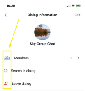
For example set up images for the Info Dialog screen:
public class CustomImageTheme: ThemeImageProtocol {
    public var avatarUser: Image = Image("AvatarUser")
    public var avatarGroup: Image = Image("AvatarGroup")
    public var avatarPublic: Image = Image("AvatarPublic")
    public var user: Image = Image(systemName: "person")
    public var groupChat: Image = Image(systemName: "person.3") // default: person.2
    public var publicChannel: Image = Image(systemName: "megaphone")
    public var leave: Image = Image(systemName: "person.fill.xmark") // default: rectangle.portrait.and.arrow.forward
    public var leavePNG: Image = Image("Leave")
    public var newChat: Image = Image(systemName: "square.and.pencil")
    public var back: Image = Image(systemName: "chevron.backward")
    public var close: Image = Image(systemName: "xmark")
    public var conference: Image = Image(systemName: "person.3")
    public var chat: Image = Image(systemName: "message")
    public var camera: Image = Image(systemName: "camera")
    public var avatarCamera: Image = Image("AvatarCamera")
    public var checkmark: Image = Image(systemName: "checkmark")
    public var attachmentPlaceholder: Image = Image("attachmentPlaceholder")
    public var info: Image = Image(systemName: "info.circle")
    public var bell: Image = Image(systemName: "bell")
    public var magnifyingglass: Image = Image(systemName: "magnifyingglass.circle") // default: magnifyingglass
    public var chevronForward: Image = Image(systemName: "chevron.forward")
    public var trash: Image = Image(systemName: "trash")
    public var plus: Image = Image(systemName: "plus.app")
    public var mic: Image = Image(systemName: "mic")
    public var smiley: Image = Image(systemName: "smiley")
    public var paperclip: Image = Image(systemName: "paperclip")
    public var paperplane: Image = Image(systemName: "paperplane.fill")
    public var keyboard: Image = Image(systemName: "keyboard")
    public var record: Image = Image(systemName: "record.circle")
    public var wave: Image = Image("wave")
    public var play: Image = Image(systemName: "play.fill")
    public var pause: Image = Image(systemName: "pause.fill")
    public var photo: Image = Image(systemName: "photo")
    public var delivered: Image = Image("delivered")
    public var read: Image = Image("delivered")
    public var send: Image = Image("send")
    public var doctext: Image = Image(systemName: "doc.text.fill")
    public var speakerwave: Image = Image(systemName: "speaker.wave.1.fill")
    public var message: Image = Image(systemName: "message")
    public var robot: Image = Image("Robot")

    public init() {}
}
Great! Now let’s apply these changes.
Let’s create a class for customizing all the themes of the QuickBlox iOS UI Kit, including the Image Theme.
class AppTheme: ThemeProtocol, ObservableObject {
    @Published var color: ThemeColorProtocol
    @Published var font: ThemeFontProtocol
    @Published var image: ThemeImageProtocol
    @Published var string: ThemeStringProtocol

    init(color: ThemeColorProtocol,
         font: ThemeFontProtocol,
         image: ThemeImageProtocol,
         string: ThemeStringProtocol) {
        self.color = color
        self.font = font
        self.image = image
        self.string = string
    }
}
Set this up and apply your theme in a convenient place in your application, for example at the QuickBlox iOS UI Kit entry point:
var appTheme: AppTheme = AppTheme(color: CustomThemeColor(), font: CustomThemeFont(), image: CustomImageTheme(), string: CustomThemeString())

QuickBloxUIKit.settings.theme = appTheme // Custom color,font,images and string themes setting.
Your image theme will be applied to the QuickBlox iOS UI Kit UI. Compare the images below, the first image has default images and the second image has custom images:
Default Image Theme:
Custom Image Theme:
This is what we wanted!
Wrapping up
Congratulations! You’ve now successfully navigated the realm of customizing font and image themes in the QuickBlox iOS UI Kit. By following this tutorial, you’ve gained a powerful toolkit to elevate your app’s visual aesthetics to new heights!
Are you interested in adding exciting AI functionality to your iOS app? We’ve just released some exciting easy-to-implement features including AI Answer Assist and AI Translate.
Learn more about: Supercharge your iOS Chat App with OpenAI: Meet AI Answer Assist
Have some ideas about how we can improve our UI Kits? Have suggestions regarding additional features needed for your projects. Please get in touch with the QuickBlox development team via Discord.
Have Questions? Need Support?
Join the QuickBlox Developer Discord Community, where you can share ideas, learn about our software, & get support.
Join QuickBlox Discord
 AI Agent — automate conversations and workflows. Now available on Free plan