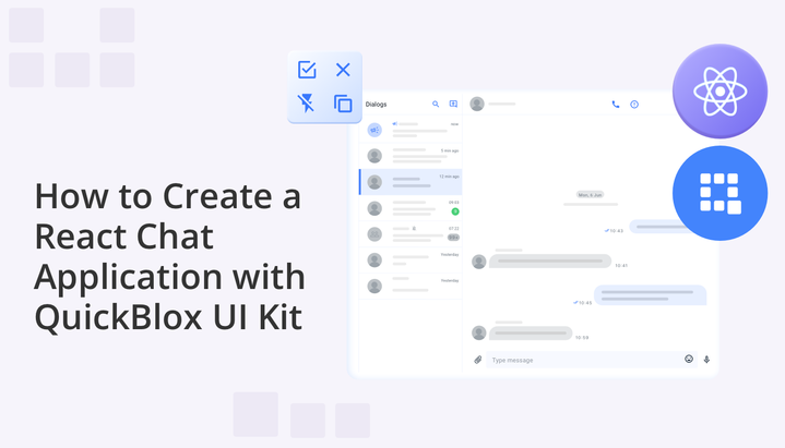
Effective communication and real-time interaction have become paramount in the realm of web and mobile applications. React, a popular JavaScript library for building user interfaces, offers a versatile platform for creating dynamic and engaging applications. When combined with the QuickBlox UI Kit, an intuitive and feature-rich toolkit, developers can easily create a robust chat application that enables seamless conversations and enhances user engagement.
In this tutorial, we will show you how to leverage the power of React and the QuickBlox UI Kit to swiftly create a fully functional chat application, opening up a world of possibilities for immersive and interactive user experiences. We will guide you through a series of simple steps for building chat functionalities, including setting up your development environment, installing necessary libraries and tools, and creating an appealing user interface for your chat.
Get ready to elevate your product by implementing chat today!
Why Your React App Needs Chat
Integrating chat functionality into your React application can bring numerous benefits to enhance user engagement and communication. With chat, you can facilitate real-time conversations, enabling users to interact and exchange information seamlessly within your application. This fosters a sense of community and enables users to collaborate, discuss ideas, and provide instant feedback.
Chat also allows for personalized and interactive experiences, as you can implement features like chatbots or AI assistants to provide instant support, answer queries, and offer tailored recommendations. Additionally, chat provides a platform for sharing multimedia content, such as images or videos, which can enrich the communication experience. Overall, integrating chat into your React applications enhances user connectivity, promotes collaboration, and improves overall user satisfaction.
QuickBlox React UI Kit
The QuickBlox UI Kit offers a comprehensive set of tools and components that simplify the integration of chat functionality into your React applications. With the React UI Kit, you can enhance your application by enabling real-time messaging and communication capabilities in just a few steps.
Key Features of QuickBlox UI Kit include:
- Real-time Messaging: Enable users to instantly send and receive messages in one-on-one or group chats.
- Customizable User Interface: Design a chat interface that aligns with your application’s branding and user experience.
- Rich Chat Features: Enhance the user experience with features like typing indicators, message history, file attachments, and message notifications.
- Integration with React: Seamlessly integrate the React UI Kit into your React application using the provided guides and documentation.
- Powerful platform: Enjoy access to QuickBlox’s powerful backend services, which provide the platform for the UI Kits, offering secure and scalable communication capabilities.
Let’s explore the possibilities of the UI Kit and unlock the power of chat functionality in your React applications. Now, let’s proceed to setting up the environment, designing a beautiful user interface, and learning how to start using chat today to improve your product!
Please note, the following project is based on a code example that can be found at the following link: https://github.com/QuickBlox/examples/tree/main/Articles/js/react-chat-ui-kit-demo-app
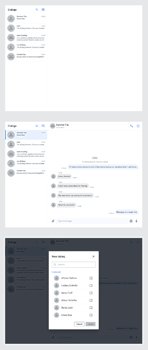
Table of Contents
- Part 1. Setting up the Environment
- Part 2. Creating a React Project with TypeScript
- Part 3: Adding Dependencies to a React Project
- Part 4: Adding QBconfig.ts File to Your React Application
- Part 5: Updating the Project Structure
- Part 6: Creating the SignIn, SignUp, and Auth Components
- Part 7: Creating the Main Window with Chat Provider
- Part 8: How to Configure QuickBloxUIKitProvider
- Wrapping up
Part 1: Setting up the Environment
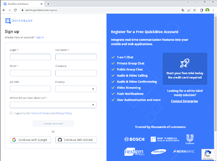
QuickBlox provides powerful tools for application development. For the first part of this project you will need to register for a QuickBlox account and create an application.
Registering a QuickBlox Account
- Go to the official QuickBlox website: https://quickblox.com.
- Click on the “Sign Up”.
- Fill in the required information, including your name, email address, and password.
- Complete any security verification if prompted.
- Click the “Sign Up” button to complete the account registration.
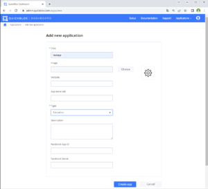
Creating an Application on QuickBlox
- After successfully registering and logging into your QuickBlox account, navigate to the “Applications” section.
- Click on the “Create new app” button.
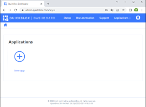
- Fill in the application details, including the name and type of application you want to create. Follow the on-screen instructions to complete the application creation process.
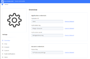
Once these steps are completed, you will have a registered QuickBlox account and a created application. This will enable you to utilize the powerful features of QuickBlox for developing and deploying your application.
Note: It is important to follow the official QuickBlox instructions to successfully register your account and create the application without any issues.
Part 2: Creating a React Project with TypeScript
In this section, we will provide a step-by-step guide on how to create a React project using TypeScript. TypeScript is a statically typed superset of JavaScript that provides enhanced development capabilities.
Ensure that Node.js is installed on your computer. You can download it from the official Node.js website.
Open your command prompt or terminal and check the Node.js version by running the command:
node -v
Make sure you have the npm package manager installed by running the command:
npm -v
Creating a New Project
Removing Default Project Content
Before proceeding with your own development, it’s recommended to remove the default content that comes with the newly created React project. This includes the sample components and styles provided by the Create React App template.
Delete or modify the files in the src directory according to your project requirements. You can also remove the default styles in the App.css file and the default logo in the logo.svg file.
By cleaning up the default project content, you can start with a clean slate and build your React application from scratch.
Running the Project
- Navigate to your project directory using the command cd my-app (replace my-app with your project name).
- Start the project by running the command:
npm start
- Open your browser and go to http://localhost:3000. You will see your React application up and running.
You have now successfully created a React project using TypeScript and removed the default project content. You can start developing your application, adding components and functionality based on the capabilities provided by React and TypeScript.
Part 3: Adding Dependencies to a React Project
To successfully integrate QuickBlox functionality into our React project, we need to add two main dependencies: QuickBlox JavaScript SDK and QuickBlox React UI Kit. By following the documentation, we can easily add these packages to our project.
Installing Dependencies
- Open your command prompt or terminal and navigate to the root folder of your React project.
- Run the following command to install the quickblox package:
npm install quickblox --save
- Then, execute the following command to install the quickblox-react-ui-kit package:
npm install quickblox-react-ui-kit --save
Importing Dependencies in the Project
Using QuickBlox in the Project
Now that the dependencies are successfully added to your project, you can utilize QuickBlox functionality within the relevant components and modules of your application. Refer to the QuickBlox Javascript SDK and the React UI Kit documentation for more detailed information on the available features and components you can use.
Adding additional packages in the Project
In this section, we will guide you through the process of adding the following packages to your project:
node-sass: This package enables you to use Sass (Syntactically Awesome Style Sheets) in your React components. Sass provides powerful features like variables, nesting, and mixins, allowing you to write cleaner and more maintainable CSS code.
To install node-sass, run the following command in your command prompt or terminal:
npm install node-sass --save
For more information and detailed usage instructions, you can visit the node-sass package on npm website.
react-router-dom: This package provides routing capabilities for your React application. It allows you to define different routes and render specific components based on the current URL. React Router is a popular choice for managing navigation and creating single-page applications.
To install react-router-dom, execute the following command:
npm install react-router-dom --save
For more information and detailed usage instructions, you can visit the react-router-dom package on npm.
@mui/material: This package is a Material-UI library for building user interfaces in React. It provides a set of pre-built UI components and styling options that follow the Material Design guidelines. With Material-UI, you can easily create visually appealing and responsive UIs for your React projects.
To install @mui/material, use the following command:
npm install @mui/material --save
For more information and detailed usage instructions, you can visit the @mui/material package on npm.
@mui/icons-material: This package is an extension of the Material-UI library and provides a wide range of Material-UI icons that you can use in your application. These icons can enhance the visual appeal and user experience of your UI components.
To install @mui/icons-material, run the following command:
npm install @mui/icons-material --save
For more information and detailed usage instructions, you can visit the @mui/icons-material package on npm.
By adding these packages to your React TypeScript project, you can leverage Sass for better styling, implement routing capabilities, and utilize the rich set of UI components and icons provided by Material-UI. These packages will help you create more dynamic, visually appealing, and user-friendly applications.
Part 4: Adding QBconfig.ts File to Your React Application
To ensure proper configuration and functionality of the QuickBlox UIKit in your React application, it is essential to add a QBconfig.ts file to the src folder. This file allows you to define the necessary parameters for the QuickBlox UIKit.
The QBconfig.ts file contains various configuration settings that determine how the QuickBlox UIKit interacts with the QuickBlox JavaScript SDK and the backend services. These settings include:
- appId: This parameter represents the unique identifier assigned to your QuickBlox application. It helps establish a connection between the frontend and backend components.
- authKey and authSecret: These parameters are used for authentication purposes. They ensure secure communication between your application and the QuickBlox backend.
- accountKey: This parameter identifies your QuickBlox account and provides access to the associated services.
- apiEndpoint and chatEndpoint: These parameters define the API and chat endpoints provided by QuickBlox. They specify the URLs to which the QuickBlox UIKit will send requests for various functionalities.
To illustrate, here is an example of a QBconfig.ts file:
export const QBConfig = {
	credentials: {
 		appId:: 'YOUR_APP_ID',
 		authKey:: 'YOUR_AUTH_KEY',
     		authSecret:: 'YOUR_AUTH_SECRET',
accountKey: 'YOUR_ACCOUNT_KEY',
sessionToken:: '',
},
appConfig: {
		chatProtocol: {
			Active: 2,
},
debug: false,
endpoints: {
		apiEndpoint:: 'https://api.quickblox.com',,
chatEndpoint: 'chat.quickblox.com',
},
on: {
async sessionExpired(handleResponse: any, retry: any) {
  console.log(`Test sessionExpired… ${handleResponse} ${retry}`);
}
},
streamManagement: {
		Enable: true,
},
},
};
In this example, make sure to replace the placeholder values (YOUR_APP_ID, YOUR_AUTH_KEY, YOUR_AUTH_SECRET, and YOUR_ACCOUNT_KEY) with the actual values obtained from your QuickBlox application.
By adding the QBconfig.ts file to your React application, you ensure that the QuickBlox UIKit is properly configured and can interact seamlessly with the QuickBlox backend services.
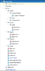
Part 5: Updating the Project Structure
In order to enhance the organization and maintainability of your project, it is recommended to make changes to the structure of the src folder. This involves creating the following subdirectories:
- assets: This directory is used for specifying customizations for your application, such as images, fonts, or any other static files.
- layout: The layout directory is intended for housing components that represent different layers or layouts of your application’s user interface.
- styles: The styles directory is designated for storing SCSS (Sassy CSS) files, which contain the custom styles and styling-related logic for your application.
To implement these changes, follow the steps below:
- Create a subdirectory named CustomeTheme within the assets directory. This subdirectory will hold the CustomeTheme.ts file, which allows you to define and customize the theme for your application.
- Within the layout directory, create another subdirectory called Auth. This subdirectory will contain the Auth.tsx and Auth.scss files. These files will define the components and associated styles for the authentication layer of your application.
- In the main src directory of your project, add the necessary files for two components: SignIn (responsible for handling user login) and SignUp (used for user registration). These files will be located directly in the src directory.
By implementing these changes to your project structure, you can achieve a more organized and modular approach to developing your React application. The new directories will help you separate concerns and improve code maintainability.
Please note that below is a screenshot of the project structure after implementing these changes:
Part 6: Creating the SignIn, SignUp, and Auth Components
In order to implement the login and registration functionality in our application, we will create three components: SignIn, SignUp, and Auth.
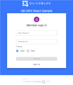
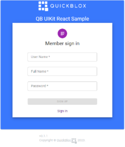
The SignIn component is responsible for handling user login. It provides a form where users can enter their credentials, such as username and password, to authenticate themselves. The @mui/material package is used to create the user interface elements for the SignIn component.
The SignUp component is used for user registration in the application. It allows new users to create an account by providing their desired username, password, and other relevant information. The SignUp component also utilizes elements from the @mui/material package to create an intuitive and user-friendly registration form.
The Auth component serves as a common layout for the login and registration pages. It provides the necessary structure and handles the overall composition of the authentication flow. The Auth component ensures a seamless user experience by managing the transitions between the SignIn and SignUp components based on user actions.
To view the actual code implementation of these components, refer QuickBlox JavaScript SDK GitHub Repository.
By utilizing these components, you can create a comprehensive authentication system for your React application, allowing users to securely log in and register.
Part 7: Creating the Main Window with Chat Provider
To start, let’s focus on the main component of your application, App. We will add the following states to it:
- currentUser: stores the parameters of the current user.
- authorized: indicates whether the user is logged in or not.
- theme: represents the current theme of the application.
- errorMessage: holds any error messages related to authentication.
To work with QuickBlox, you need to initialize a React variable called qbUIKitContext of type QBDataContextType using React DataContext. This variable contains important data and settings to use QuickBlox SDK and connects various components of the application, providing them access to shared data.
After that, in the application component, we will add QuickBloxUIKitProvider from the quickblox-react-ui-kit package. This provider will handle the integration of chat features into your application.
Here’s an example code snippet of the App component:
import { useState } from 'react';
import { QuickBloxUIKitProvider, QuickBloxUIKitDesktopLayout }
from 'quickblox-react-ui-kit';
function App() {
const [authorized, setAuthorized] = useState(false);
const [theme, setTheme] = useState('lightTheme');
const [errorMessage, setErrorMessage] = useState('');
const initLoginData = {
userName: '',
password: '',
};
const [currentUser, setCurrentUser] = useState(initLoginData);
return (
<QuickBloxUIKitProvider
maxFileSize={100 * 1000000}
accountData={{ ...QBConfig.credentials, sessionToken: '' }}
loginData={{
userName: currentUser.userName,
password: currentUser.password,
}}
>
<div className="App">
<QuickBloxUIKitDesktopLayout theme={new CustomTheme()} />
</div>
</QuickBloxUIKitProvider>
);
}
export default App;
In the code snippet above, we define the initial state values and utilize the useState hook to manage them. The currentUser state represents the current user’s information, while the authorized state indicates whether the user is authenticated. The theme state stores the current theme of the application, and the errorMessage state holds any error messages related to authentication.
We then wrap the main content of the App component with the QuickBloxUIKitProvider. This provider allows us to integrate the QuickBlox chat functionality seamlessly into our application. We pass various parameters to the provider, such as maxFileSize to set the maximum file size for message attachments, accountData to define the connection parameters for the SDK, and loginData to specify the user’s credentials for logging into the chat.
In the QuickBloxUIKitDesktopLayout component, we pass an instance of the CustomTheme class as a parameter to set a specific color scheme for the application. Instance of the CustomTheme class defines various colors and styles used in the application.
Next, let’s add routing to our application. We’ll define three routes:
- ‘/sign-in’: This route is responsible for the login functionality, and it will render the SignIn component.
- ‘/sign-up’: This route handles user registration and displays the SignUp component.
- ‘/’: This route represents the starting point of our UIKit application.
To implement routing, we’ll update the code within the App component as follows:
import { Routes, Route } from 'react-router-dom';
import { QuickBloxUIKitProvider, QuickBloxUIKitDesktopLayout }
from 'quickblox-react-ui-kit';
import CustomTheme from './assets/CustomTheme/CustomTheme';
import Auth, {UserData} from "./layout/Auth/Auth";
import SignIn from "./SignIn/SignIn";
import SignUp from "./SignUp/SignUp";
// ...
function App() {
// ...
return (
<QuickBloxUIKitProvider
// ...
>
<div className="App">
<Routes>
<Route>
path="/"
element={
authorized ? (
<div>
<QuickBloxUIKitDesktopLayout
theme={new CustomTheme()} />
</div>
) : (
<Auth>
<SignIn errorMessage={errorMessage} />
</Auth>
)
}
</>
<Route>
path="/sign-in"
element={
<Auth>
<SignIn errorMessage={errorMessage} />
</Auth>
}
</>
<Route>
path="/sign-up"
element={
<Auth>
<SignUp errorMessage={errorMessage} />
</Auth>
}
</>
</Routes>
</div>
</QuickBloxUIKitProvider>
);
}
export default App;
In the updated code, we’ve imported the Routes and Route components from the react-router-dom library. We then added the component as a wrapper to define our application’s routes.
Now, when the user navigates to ‘/’, we check if they are authorized. If they are, we render the main content, “UIKit app.” If not, we render the SignIn component within the Auth component.
Similarly, the ‘/sign-in’ and ‘/sign-up’ routes render the respective components, SignIn and SignUp, within the Auth component.
To configure QuickBloxUIKitProvider and use QuickBloxUIKit in your application, follow these steps:
1. Initialize DataContext:
To work with QuickBlox, it is necessary to initialize the DataContext. It contains important data and settings for using QuickBloxSDK. The DataContext connects various components of the application and provides them access to shared data.
2. Create a Global ConnectionRepository Object:
In the application context, create a global ConnectionRepository object that manages and maintains the connection to the QuickBlox server. It handles connection establishment and tracking, and provides methods for performing server operations.
3. Implement the MVVM Pattern:
QuickBlox UIKit React utilizes the MVVM (Model-View-ViewModel) pattern for code organization. MVVM helps separate the view logic from the business logic and data processing. In the context of QuickBlox, the Presentation layer (ViewModel) interacts with the DataDomain, which includes DataSource, UseCases, and Repositories.
DataSource: The DataSource layer is responsible for interacting with external data sources, such as the QuickBlox server. It provides methods for data retrieval, storage, and updates.
UseCases: UseCases contain the application’s business logic. They define the operations that can be performed with the data and ensure their processing.
Repositories: Repositories are interfaces or classes that abstract data access. They combine DataSource and UseCases and provide a simplified interface for working with data.
By placing the QuickBloxUIKitDesktopLayout component inside the QuickBloxUIKitProvider, you implement the Presentation layer of the MVVM pattern. This layer facilitates the connection between the view and the ViewModel.
Let’s add the QBHelpers.tsx file to our project, which includes working with the QuickBlox JS SDK. This file implements the following functions:
- SDK initialization
- User creation
- User authentication
- User existence check
- Action creation for account creation
QBHelpers.tsx is an essential part of working with the Quickblox Chat UI Kit in a React JS application. Utilize these functions to create a powerful and reliable chat feature in your React application.
Now, let’s take a closer look at each function presented in this file.
Initializing Quickblox SDK with `prepareSDK`
First, you need to initialize the QuickBlox SDK. The prepareSDK function is responsible for setting up the SDK and connecting the library to the global window object. This is an important step before starting to work with QuickBlox.
// Function for initializing Quickblox SDK
export const prepareSDK = async (): Promise<void> => {
// Check if the SDK is already installed in the environment
if ((window as any).QB === undefined) {
if (QB !== undefined) {
(window as any).QB = QB;
} else {
let QBLib = require('quickblox/quickblox.min');
(window as any).QB = QBLib;
}
}
// SDK initialization parameters
const APPLICATION_ID = QBConfig.credentials.appId;
const AUTH_KEY = QBConfig.credentials.authKey;
const AUTH_SECRET = QBConfig.credentials.authSecret;
const ACCOUNT_KEY = QBConfig.credentials.accountKey;
const CONFIG = QBConfig.appConfig;
// Initialize Quickblox SDK
QB.init(APPLICATION_ID, AUTH_KEY, AUTH_SECRET, ACCOUNT_KEY, CONFIG);
};
Creating and Authenticating Users
To enable users to use the chat in your application, you need to allow them to create accounts and log in. In the QBHelpers.tsx file, there are several functions that accomplish these tasks:
- Function createUser – Creating a New User
export const createUser = (user: QBUser): Promise<QBUser> => {
// Access Quickblox SDK
const QBLib = (window as any).QB;
return new Promise((resolve, reject) => {
// Prepare user data for creation
const userLoginData = {
login: user.login,
password: user.password,
full_name: user.full_name,
custom_data: user.custom_data || 'You could store any string value or null in this field',
};
// Create a new user
QBLib.users.create(userLoginData, (createErr: any, createRes: any) => {
if (createErr) {
reject(createErr);
} else {
resolve(createRes);
}
});
});
};
Function createUserSession – Creating a Session for the User
export const createUserSession = async (loginData: LoginData): Promise<ParamsConnect> => {
return new Promise((resolve, reject) => {
// Create a session for the user based on the provided authentication data
QB.createSession(loginData, async (errorCreateSession: any, session: any) => {
if (errorCreateSession) {
reject(errorCreateSession)
} else {
const userId: number = session.user_id;
const password: string = session.token;
const paramsConnect: ParamsConnect = { userId, password };
resolve(paramsConnect);
}
});
});
};
Function createAppSession – Creating an Application Session
export const createAppSession = (): Promise<any> => {
const QBLib = (window as any).QB;
return new Promise((resolve, reject) => {
// Create an application session
QBLib.createSession((sessionErr: any, sessionRes: any) => {
if (sessionErr) {
reject(sessionErr);
} else {
resolve(sessionRes);
}
});
});
};
Function connectToChatServer – Connecting to the Chat Server
export const connectToChatServer = async (paramsConnect: ParamsConnect, userLogin: string): Promise<AuthorizationData> => {
return new Promise((resolve, reject) => {
// Establish a connection to the Quickblox chat server based on the session data
QB.chat.connect(paramsConnect, async (errorConnect: any, resultConnect: any) => {
if (errorConnect) {
reject(errorConnect);
} else {
const authData: AuthorizationData = {
userId: paramsConnect.userId,
password: paramsConnect.password,
userName: userLogin,
sessionToken: paramsConnect.password
};
resolve(authData);
}
});
});
};
Function canLogin – Checking User Authentication Possibility
export const canLogin = async (user: QBUser) => {
  const QBLib = (window as any).QB;
  return new Promise((resolve, reject) => {
    // Check if the user can be authenticated with the provided data
    QBLib.login(user, (loginErr: any, loginRes: any) => {
      if (loginErr) {
        reject(loginErr);
      } else {
        resolve(loginRes);
      }
    });
  });
};
Function logout – Logging Out the User
export const logout = () => {
  const QBLib = (window as any).QB;
  // Disconnect the user from the chat and destroy the current session
  QBLib.chat.disconnect();
  QBLib.destroySession(() => null);
};
Checking User Existence and Creating an Action
- Constant qbDefaultUser – Default User Information Object
export const qbDefaultUser: QBUser = {
  // Default user data
};
Function isUserExist – Checking User Existence
const isUserExist = async (user: QBUser): Promise => {
  let userExists = true;
  // Check if the user exists with the provided data
  await canLogin(user).catch(() => {
    userExists = false;
  });
  return userExists;
};
Function createUserAction – Creating an Action for User Creation
export const createUserAction = async (data: UserData): Promise<UserCreationStatus> => {
let resultCreateUserAction: UserCreationStatus = UserCreationStatus.UserCreated;
// Create an application session
createAppSession().then(async () => {
const user: QBUser = qbDefaultUser;
user.login = data.login;
user.full_name = data.fullName || '';
user.password = data.password;
const userExists: boolean = await isUserExist(user);
if (userExists) {
resultCreateUserAction = UserCreationStatus.UserExists;
} else {
// Create a new user
createUser(user)
.then((createRes) => {
resultCreateUserAction = UserCreationStatus.UserCreated;
})
.catch((createErr) => {
console.log(stringifyError(createErr));
resultCreateUserAction = UserCreationStatus.UserCreationError;
});
}
}).catch((reason) => {
console.log(stringifyError(reason));
resultCreateUserAction = UserCreationStatus.AppSessionCreationError;
});
return resultCreateUserAction;
};
Let’s add the following functions to our App.tsx file to handle user actions:
- createUserHandler – Handler for Creating New Users.
This handler is responsible for the process of creating new users. It utilizes the createUserAction function from the QBHelpers.tsx file, which creates a new user and handles different scenarios such as successful creation, existing user, and authentication errors.
const createUserHandler = async (data: UserData): Promise<void> => {
setErrorMessage('');
const resultCreateUser = await createUserAction(data);
logout();
switch (resultCreateUser) {
case UserCreationStatus.UserCreated:
setUserAuthorized(false);
navigate('/sign-in');
break;
case UserCreationStatus.UserExists:
setErrorMessage('User already exists');
setUserAuthorized(false);
navigate('/sign-up');
break;
default:
setErrorMessage('Auth Fail');
setUserAuthorized(false);
navigate('/sign-up');
break;
}
};
loginHandler – Handler for User Authentication
This handler is responsible for the authentication process for users. It uses the user data entered in the login form and calls the loginAction function, which handles the creation of a user session and connects to the chat server.
const loginHandler = async (data: any): Promise<void> => {
setErrorMessage('');
const loginData: LoginData = {
login: data.login,
password: data.password
};
setCurrentUser(loginData);
setTheme(data.nameTheme);
await loginAction(loginData);
};
logoutUIKitHandler – Handler for User Logout
This handler performs the logout process for the current user. It releases the UIKit context, resets the current user data, sets the user as not authorized, changes the application theme to light, and redirects the user to the sign-in page.
const logoutUIKitHandler = async () => {
  qbUIKitContext.release();
  setCurrentUser({ login: '', password: '' });
  setUserAuthorized(false);
  document.documentElement.setAttribute('data-theme', 'light');
  navigate('/sign-in');
};
loginAction – Operations for Creating a User Session and Connecting to the Chat Server
This function handles the operations for creating a user session and connecting to the chat server. It utilizes the createUserSession and connectToChatServer functions from the QBHelpers.tsx file to create the user session and establish a connection to the chat server.
const loginAction = async (loginData: LoginData): Promise<void> => {
if (isSDKInitialized && !isUserAuthorized) {
if (loginData.login.length > 0 && loginData.password.length > 0) {
await createUserSession(loginData)
.then(async resultUserSession => {
await connectToChatServer(
resultUserSession,
currentUser.login
)
.then(async authData => {
await qbUIKitContext.authorize(authData);
qbUIKitContext.setSubscribeOnSessionExpiredListener(() => {
console.timeLog('call OnSessionExpiredListener ... start');
logoutUIKitHandler();
console.log('OnSessionExpiredListener ... end');
});
setSDKInitialized(true);
setUserAuthorized(true);
document.documentElement.setAttribute('data-theme', theme);
navigate('/');
})
.catch(errorChatConnection => {
handleError(errorChatConnection);
});
})
.catch(errorUserSession => {
handleError(errorUserSession);
});
}
}
};
handleError – Function for Error Handling
This function handles errors that may occur during user authentication. It displays an error message and redirects the user to the sign-in page.
const handleError = (error: any): void => {
  console.log('error:', JSON.stringify(error));
  setErrorMessage(error.message.errors[0]);
  setUserAuthorized(false);
  navigate('/sign-in');
};
Together, these functions provide flexible and reliable management of the user creation and authentication process, as well as error handling for smooth application operation.
Let’s revise the text without providing detailed code for the components.
We will enhance the SignIn and SignUp components by adding click handlers for the user login and user creation buttons in the App.tsx file:
...
<SignIn signInHandler={loginHandler} errorMessage={errorMessage}/>
...
<SignUp signUpHandler={createUserHandler} errorMessage={errorMessage} />
...
To ensure the SDK is initialized when the application starts, we will add useEffect hooks. These hooks allow us to automatically perform certain actions when specific dependencies change or when a component mounts. In our case, we will need two useEffect hooks: one for SDK initialization and the other for automatically authenticating the current user.
// useEffect hook for SDK initialization
  useEffect(() => {
    if (!isSDKInitialized) {
      prepareSDK()
        .then((result) => {
          setSDKInitialized(true);
          setUserAuthorized(false);
        })
        .catch((e) => {
          console.log('SDK initialization error: ', e);
        });
    }
  }, []);

  // useEffect hook for automatically authenticating the current user
  useEffect(() => {
    if (isSDKInitialized) {
      if (
        currentUser &&
        currentUser.login.length > 0 &&
        currentUser.password.length > 0
      ) {
        loginAction(currentUser);
      } else {
        console.log('Authentication flow has been canceled...');
      }
    }
  }, [isSDKInitialized]);
In the provided code, we added two useEffect hooks:
- The first useEffect hook runs once when the App component mounts and initializes the SDK using the prepareSDK() function. Upon successful initialization, it sets the isSDKInitialized state to true and sets the userAuthorized state to false to reset user authentication.
- The second useEffect hook watches for changes in the isSDKInitialized state. When isSDKInitialized becomes true, the hook checks if the current user has a login and password. If so, it automatically calls the loginAction(currentUser) function to authenticate the user. If the current user does not have a login or password, it logs a message stating that the authentication flow has been canceled.
With the useEffect hooks, we ensure that the SDK is initialized when the application starts and automatically authenticate the user if possible. This will provide a smoother user experience and enhance the usability of the application.
Implementing Logout and Theme Switching Buttons
We can further enhance our application by adding new features using components from the React UI Kit. We will add three buttons to the root route of our application, provided to us as components from the React UI Kit. These buttons will be placed before the QuickBloxUIKitDesktopLayout component. By clicking these buttons, we will be able to easily perform a logout action and switch the theme in the React UI Kit.
Connecting Button Components
To begin, we need button components for the logout action and theme switching, which we will take from the React UI Kit library. These components will provide us with pre-styled buttons, allowing us to focus on their handling logic.
Example code for the logout and theme switching buttons:
//......
<Route
path="/"
element={
isUserAuthorized
?
<div>
<div>
<div className="main-buttons-wrapper">
<MainButton
typeButton={TypeButton.outlined}
title="Light Theme"
styleBox={{width: "200px", height: "20px"}}
clickHandler = {
() => { document.documentElement.setAttribute('data-theme', 'light'); }}
/>
<MainButton
typeButton={TypeButton.defaultDisabled}
title="Dark Theme"
styleBox={{width: "200px", height: "20px"}}
clickHandler = {
() => {document.documentElement.setAttribute('data-theme', 'dark');}}
/>
<MainButton
typeButton={TypeButton.danger}
title="Log Out"
styleBox={{width: "200px", height: "20px"}}
clickHandler = { logoutUIKitHandler }
/>
</div>
<QuickBloxUIKitDesktopLayout />
</div>
</div>
:
<Auth
children={
<SignIn signInHandler={loginHandler} errorMessage={errorMessage}/>} />} />
Implementing the Functionality
Now that we have connected the logout and theme switching button components, users will be able to easily perform a logout action and change the interface theme according to their preferences. By clicking the “Log Out” button, users can end their session and log out of the system. The “Light Theme” and “Dark Theme” buttons will enable users to quickly switch between light and dark themes, providing a pleasant and convenient user experience while using the application.
Wrapping Up
Well done! You’ve now completed the primary steps needed to create a React chat application using the QuickBlox UIKit. By these steps you have set up the project environment, integrated the QuickBlox SDK, and added the core chat functionality, paying special attention to message sending and user management.
You can download the example code discussed in this article and examine the implementation details.
In the next tutorial we will show you how to customize UI elements in QuickBlox UIKit, so that you can alter the UI according to your needs.
Have Questions? Need Support?
Join the QuickBlox Developer Discord Community, where you can share ideas, learn about our software, & get support.
Join QuickBlox Discord
 AI Agent — automate conversations and workflows. Now available on Free plan