Summary: In this tutorial, we guide you through customizing your app’s color scheme using the QuickBlox React UI Kit. You’ll learn how to set up your development environment, integrate the UI Kit, and modify default colors to match your brand’s identity. By the end, you’ll be equipped to create a visually appealing and brand-consistent app, enhancing both its functionality and aesthetics.
Table of Contents
Introduction
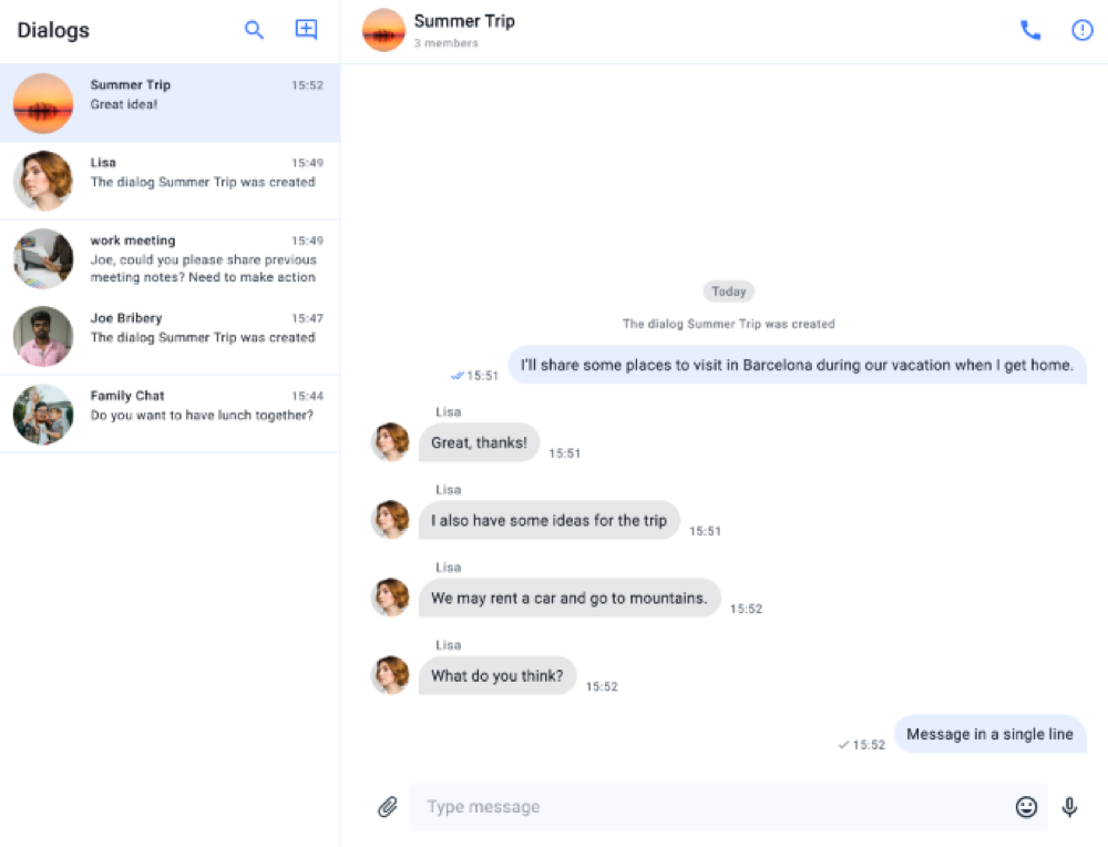
Welcome to our latest blog post on customizing your React app UI using the QuickBlox UI Kit. In a previous blog, we demonstrated how simple it was to build a fully functional chat application with QuickBlox’s powerful UI Kit. Today, we’re taking it a step further by showing you how to personalize your chat app’s appearance by modifying its color palette. Whether you want to match your brand’s colors or simply give your app a unique look, this guide will walk you through the process of customizing the color scheme in your QuickBlox-based React application. Let’s get started and make your app visually stand out!
The Benefits of QuickBlox UI Kit for React
The QuickBlox React UI Kit is a comprehensive set of pre-built UI components designed to accelerate the development of React applications, particularly those requiring real-time communication features such as chat, video calls, and messaging. By leveraging the QuickBlox UI Kit, developers can rapidly create robust and feature-rich applications without having to build everything from scratch. Some of its main components and benefits include:
- Easily create, manage, and send messages in chats using ready-made components.
- Manage contacts and users in the chat application, such as adding, deleting, and searching for contacts, as well as obtaining information about users.
- Ready-made user interface components, such as chat windows, message lists, controls, and more, can be easily integrated into an app and customized.
- The UI Kit includes authentication mechanisms, data protection, and other features that ensure application security.
- Easily adapt the interface to your needs and brand style, such as modifying the color scheme or creating custom components.
- One of the key benefits of using the QuickBlox UI Kit is its flexibility and ease of customization. Developers can easily modify the look and feel of their applications by adjusting the color palette, fonts, and other UI elements to align with their brand identity. This customization is crucial in app development as it enhances user experience, ensuring that the app not only functions well but also provides a visually appealing and cohesive interface that resonates with users.
Let’s Get Started!
Create a Chat App using React UI Kit
For this project you will first need to create a QuickBlox account, create an app, and then obtain the necessary registration data. We covered these steps in an earlier blog which you can review here: How to Create a React Chat App.
To simplify matters in this article, we will use a QuickBlox React Sample App, available in our GitHub repository, that uses QuickBlox UIKit to create a functional messaging interface.
To create your React chat application, you can follow these steps:
1. Clone the repository
Clone the React Chat UI Kit Demo App repository to your local computer.
2. Install dependencies
Navigate to the project directory and install all dependencies by running the command:
npm install.
3. Configure QuickBlox
Enter your QuickBlox registration data in the respective configuration files to establish a connection with the QuickBlox server.
4. Run the application
After configuring QuickBlox and installing dependencies, start the application by running the command:
npm start.
After that, you will be able to test the chat application in your browser.
By following these simple steps, you can quickly create your own React chat application using QuickBlox UIKit for React and customize it to meet your specific needs and requirements.
Customizing the Application User Interface
Now that you have a working chat application, we can show you how to customize it. But before we do, it’s important to identify the key elements of the user interface that will be modified.
In this tutorial, we will adjust the color scheme of all elements in QuickBlox UIKit to create a unique visual representation of the application. The customizable elements include:
- Dialog list
- Message history
- Dialog information and participant list
- Interface elements for creating and editing private and group dialogs.

For all user interface elements, we will define color schemes and fonts.
Starting from version Quickblox UIKit for React 0.3.0, you can see how individual elements look in our Storybook.
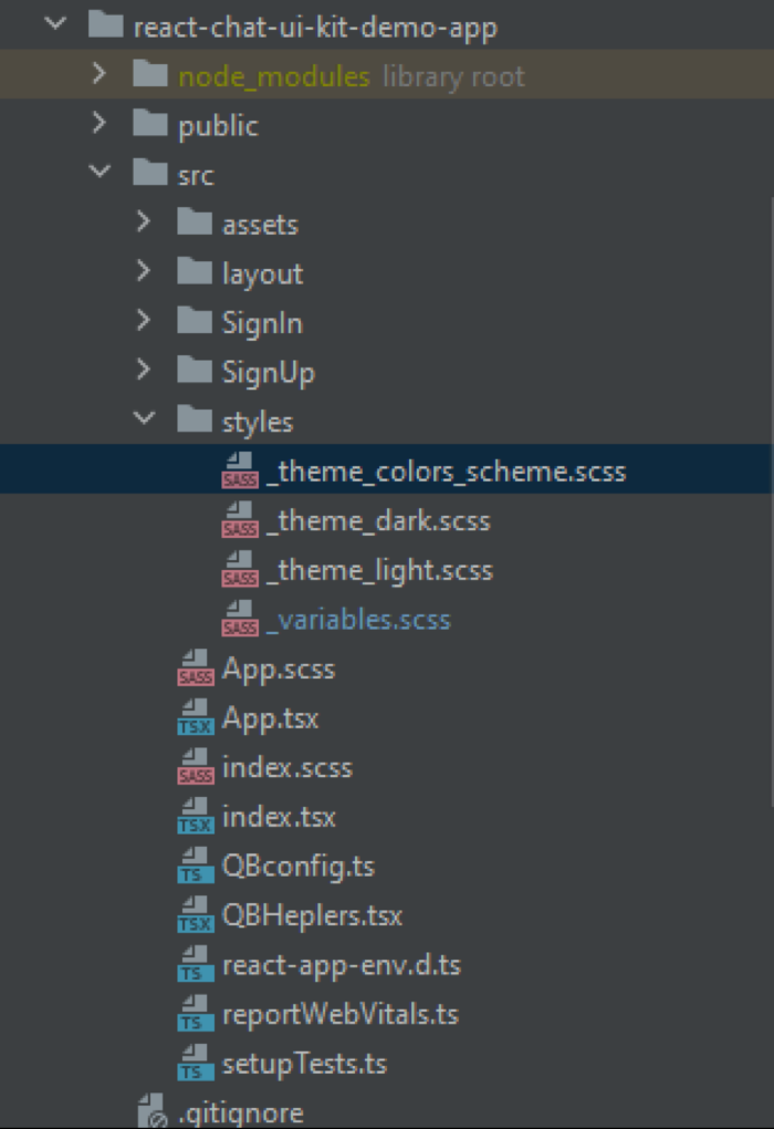
Let’s open our project that we deployed from the repository and take a look at the files where we will make changes:

We are interested in the following files:
_theme_colors_scheme.scss – a file where the color scheme is set
_variables.scss – a file where font parameters are set.
In the customization documentation (here) you can see the default scheme for main UI elements. You can create your own color scheme in Figma yourself or use resources from OpenAI’s artificial intelligence.
To simplify the task, we will leverage artificial intelligence tools – OpenAI. This tool is widely popular today and provides the opportunity to expedite and streamline the work of software developers. We will provide the structure of the color scheme presented in QuickBlox UIKit for React and ask OpenAI to generate a new color scheme for our application.
To create a new color scheme with predominance of purple shades, you first need to choose a basic purple color, which will be the basis for other shades. This will allow you to replace existing colors with similar ones, but in a new palette. I will apply a method that allows me to preserve light and dark tones, as well as adapt auxiliary and accent colors, while excluding black and blue colors.
As a basic purple shade, I suggest using the color #9B5DE5, which will be analogous to the blue #3978FC in your scheme. Then, using this basic color, we will create variations for light and dark themes, as well as for additional interface elements.
Let’s go to the website https://openai.com/, log in, and ask them to help us create a new color scheme with the following prompt:
Answer as an experienced web developer with over 10 years of experience creating and using various color schemes. I need to create a new color scheme using the constants from the existing color scheme. Please use a different color palette with predominance of purple shades. The palette should not include the color black and blue. Below is the content of my file:

$qb-light-primary: #3978FC;
$qb-light-color-background: #FFFFFF;
$qb-light-color-divider: #E7EFFF;
$qb-light-color-font: #0B121B;

$qb-dark-primary: #202F3E;
$qb-dark-color-background: #414E5B;
$qb-dark-color-divider: #FFFFFF;
$qb-dark-color-font: #3978FC;

$background-overlay-light: rgba(19, 29, 40, .80);
$background-overlay-dark: rgba(144, 151, 159, .80);
$primary-50: #E7EFFF;
$primary-100: #C4D7FE;
$primary-200: #9CBCFE;
$primary-300: #74A1FD;
$primary-400: #578CFC;
$primary-500: #3978FC;
$primary-600: #3370FC;
$primary-700: #2C65FB;
$primary-800: #245BFB;
$primary-900: #1748FA;
$primary-a-100: #FFFFFF;
$primary-a-200: #F7F9FF;
$primary-a-400: #C4CFFF;
$primary-a-700: #ABBAFF;

$secondary-50: #E4E6E8;
$secondary-100: #BCC1C5;
$secondary-200: #90979F;
$secondary-300: #636D78;
$secondary-400: #414E5B;
$secondary-500: #202F3E;
$secondary-600: #1C2A38;
$secondary-700: #182330;
$secondary-800: #131D28;
$secondary-900: #0B121B;
$secondary-a-100: #74A1FD;
$secondary-a-200: #3978FC;
$secondary-a-400: #245BFB;
$secondary-a-700: #0050DC;

$system-green-100: #C8F1D6;
$system-green-200: #A4E7BB;
$system-green-300: #80DDA0;
$system-green-400: #64D68B;
$system-green-500: #49CF77;

$error-100: #FFC4C1;
$error-200: #FF9D98;
$error-300: #FF766E;
$error-400: #FF584F;
$error-500: #FF3B30;

$information: #FDB0FF;
$highlight: #FFFDC1;
With this prompt, I got the following result:
// Purple Light Theme
$qb-light-primary: #9B5DE5;
$qb-light-color-background: #FDF2FF;
$qb-light-color-divider: #EAD6FF;
$qb-light-color-font: #3E155A;

// Purple Dark Theme
$qb-dark-primary: #5F259F;
$qb-dark-color-background: #432C6E;
$qb-dark-color-divider: #FDF2FF;
$qb-dark-color-font: #9B5DE5;

// Background Overlays
$background-overlay-light: rgba(155, 93, 229, .80);
$background-overlay-dark: rgba(95, 37, 159, .80);

// Primary Gradient
$primary-50: #F2E6FF;
$primary-100: #E0CCFF;
$primary-200: #CEB3FF;
$primary-300: #BB99FF;
$primary-400: #A87FFF;
$primary-500: #9B5DE5;
$primary-600: #8B4CC7;
$primary-700: #7B3BA9;
$primary-800: #6B2A8B;
$primary-900: #5B196D;
$primary-a-100: #FDF2FF;
$primary-a-200: #F4E6FF;
$primary-a-400: #EAD6FF;
$primary-a-700: #E0CCFF;

// Secondary Gradient (Adjusted to Purple)
$secondary-50: #ECE2F0;
$secondary-100: #D9C4E1;
$secondary-200: #C5A5D2;
$secondary-300: #B187C3;
$secondary-400: #9E68B4;
$secondary-500: #8B4CC7;
$secondary-600: #7F44B0;
$secondary-700: #733C99;
$secondary-800: #673482;
$secondary-900: #53286B;
$secondary-a-100: #BB99FF;
$secondary-a-200: #9B5DE5;
$secondary-a-400: #6B2A8B;
$secondary-a-700: #5F259F;

// System Greens (Keeping the same, as they can work with purple)
$system-green-100: #C8F1D6;
$system-green-200: #A4E7BB;
$system-green-300: #80DDA0;
$system-green-400: #64D68B;
$system-green-500: #49CF77;

// Error Colors (Keeping the same for consistency)
$error-100: #FFC4C1;
$error-200: #FF9D98;
$error-300: #FF766E;
$error-400: #FF584F;
$error-500: #FF3B30;

// Information & Highlight (Adjusted to fit into the purple theme)
$information: #C17AFF;
$highlight: #F4E1FF;
We will add the received result to the file _theme_colors_scheme.scss.
And now let’s change the font of our application. To do this, we need to go to the _variables.scss file and add font variable values:
 :root {
  --title-title-large: 500 20px/24px "Garamond", serif;
  --title-title-medium: 500 16px/24px "Garamond", serif;
  --title-title-small: 500 14px/20px "Garamond", serif;
  --label-label-large: 500 14px/20px "Garamond", serif;
  --label-label-medium: 500 12px/16px "Garamond", serif;
  --label-label-small: 500 11px/16px "Garamond", serif;
  --body-body-large: 400 16px/24px "Garamond", serif;
  --body-body-medium: 400 14px/20px "Garamond", serif;
  --body-body-small: 400 12px/16px "Garamond", serif;
  --button-fab: 500 14px/16px "Garamond", serif;
  --button-default: 700 14px/16px "Garamond", serif;
  --ui-kit-header: 500 48px "Garamond", serif;
  --ui-kit-title: 500 32px "Garamond", serif;
  --ui-kit-body: 400 17px "Garamond", serif;
}
In our application, we will use the “Garamond” font family.
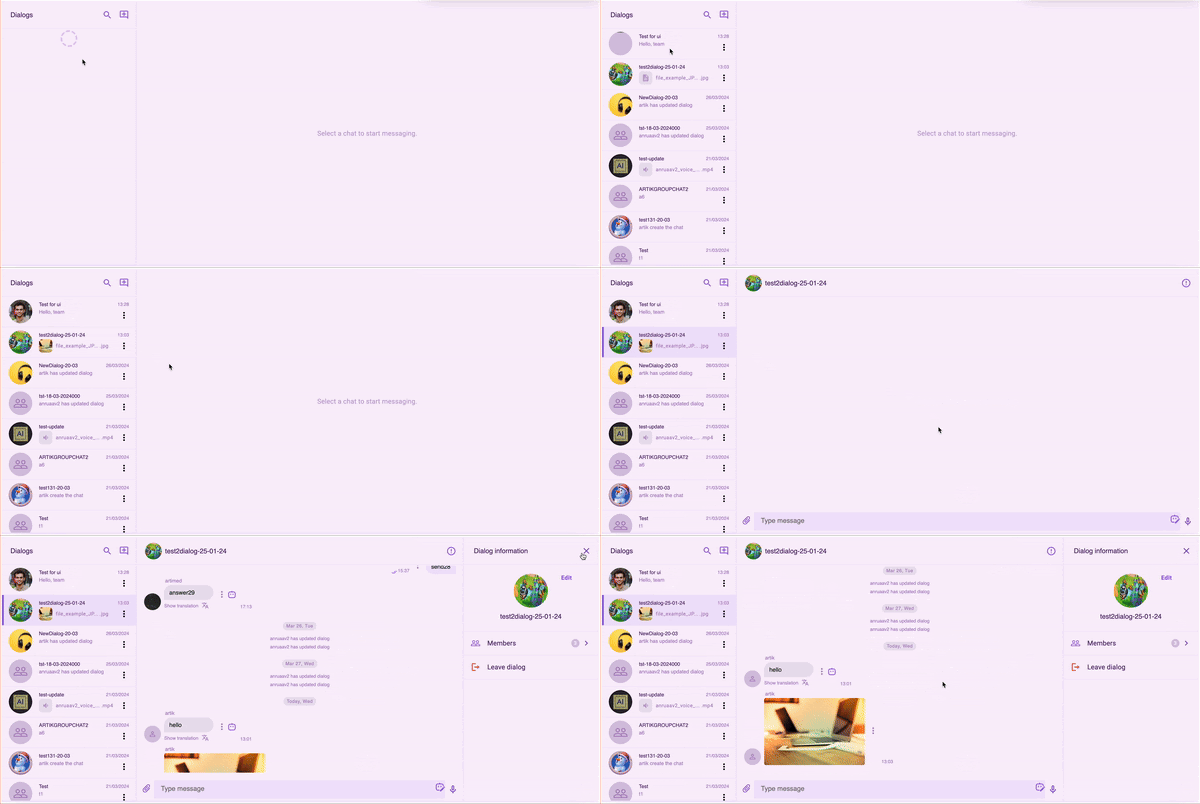
After making the changes, let’s launch our application and see how different its appearance is now.

Conclusion
In this tutorial, we walked you through the process of modifying the color scheme of a React app built with the QuickBlox UI Kit. By following these step-by-step instructions, you can customize your app’s appearance to better align with your brand identity and create a more engaging user experience.
The QuickBlox UI Kit not only simplifies the development process but also offers extensive customization options, allowing you to tailor the look and feel of your application. With these skills, you can ensure that your app stands out and provides a cohesive, visually appealing interface for your users. Happy customizing!
If you have questions, ideas or just want support consider joining our Discord Developer community!
Have Questions? Need Support?
Join the QuickBlox Developer Discord Community, where you can share ideas, learn about our software, & get support.
Join QuickBlox Discord


